
It is often thought that the hardest part of a discovery workshop is the ideation process; but as a digital product designer, I’ve come to find that this isn’t usually the case. In fact, there is often an abundance of ideas that emerge during this stage and the hardest part is feature prioritisation - deciding which features should make it to the next phase of the product and what the hierarchy of those features should be.
So, how do we decide which features to prioritise? One of the main tools that we use to do this during our workshops at Inktrap is the Effort vs. Impact exercise. This is a great way to evaluate the potential effort and impact of new features before committing to them.
What is Effort vs. Impact?
Sometimes referred to as “value vs. complexity”, the Impact vs. Effort exercise is a simple but effective method that involves plotting features along two axes labelled (you guessed it) effort and impact.
1. Effort
The effort required to deliver the feature often refers to the combined effort of the designers and developers working to produce the product.
2. Impact
The potential impact that the feature could have. We tend to refer to this as the scalability of the product and getting investment, rather than an overall impact. However, there are different ways that you can adapt these variables to fit your criteria, but more on that later.
How to conduct a successful Effort vs. Impact exercise.
This exercise isn't a solo activity and the more diverse your team is, the better are the results of the session. The great thing about this exercise is that it’s an easy and adaptable concept for everyone involved to participate in.
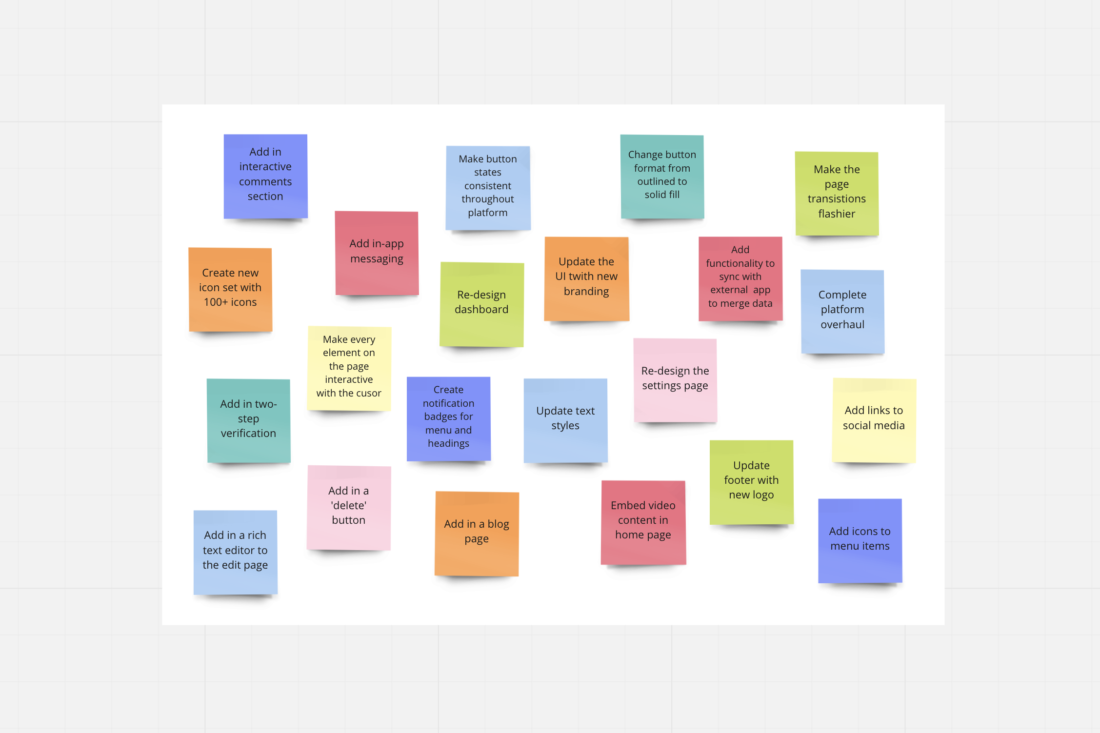
1. Gather all your features
First, you must establish and round up all of the features that have been suggested in the previous stages of the discovery workshop. You can do this using good old fashion sticky notes or if you want to get techy with it, you can use an online whiteboard tool like Miro.
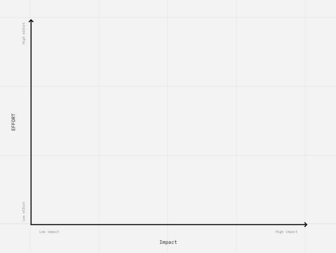
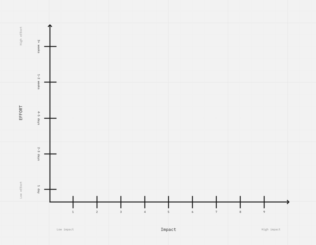
2. Create a graph and plot your features
Next, create a graph with a Y-axis labelled “Effort” and an X-axis labelled “Impact”.
3. Analyse the results
Once you have plotted all of your features onto the graph, some categories will start to form.
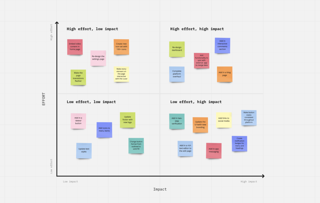
- High effort + low impact = Money pits
The features that fall into this category would require large amounts of effort from your team, but would likely result in a low impact, and so often aren’t worth prioritising.
- High effort + high impact = Major projects
Features that would require high levels of effort but could have a high impact are worth doing if you have the time and resources. These are worth prioritising if you’re certain that the feature will improve the scalability of the product and help get investments.
- Low impact + low effort = Quick fixes
The low effort and low impact features are worth doing during quieter periods or once the bigger tasks have been tackled.
- Low effort + high impact = Easy wins
Features that require low amounts of effort but could have a really high impact on your product are certainly worth doing and prioritising.
Using these categories to analyse your results provides an idea of which ideas are easy to achieve and could have a high impact, and those which will take a lot of effort for little or no reward.
Why it’s worth doing.
This exercise is quick and easy to do, and it helps teams to make informed, objective-based decisions, relevant criteria rather than subjective opinions.
One of the best things about this method is that it’s so adaptable. If our definitions of effort and impact don’t align with your goals for the exercise, then you can re-define these labels. For example, the feature’s impact could be referred to as the value it adds for the product’s users. Or you could even re-label the graph with different variables to produce a different result of the exercise entirely. For example, the graph could consist of a “time to MVP” x-axis and a “market differentiation” y-axis.
Recycling this exercise and using it in more than one way during the same workshop could also help your team to see which features are more targeted towards multiple business requirements. The main goal is for there to be an agreement on the final placement of the features on the graph and a concise list of those which you are going to take forward and prioritise in the project ahead.
Looking for some help with your next project?
Talk with us to discuss your current challenges, we'd love to help.
More like this

Figma Interaction Tips
Get the most out of Figma with helpful tips on creating captivating interactions that will keep users engaged! Discover how to use design elements and animation techniques, so you can create amazing projects.
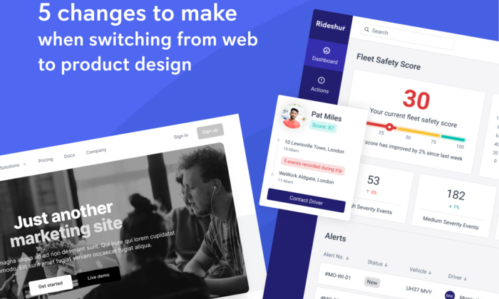
5 changes to make when switching from web to product design
Making the switch from web design to product design? Here are five key changes you'll need to make.